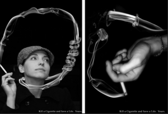
The above picture is an Ad that is against smoking. The bottom of the picture states “Kill a Cigarette and Save a Life. Yours.” It is taking pictures of people smoking and creating the illustration of a cigarette killing them. It’s not doing it in a realistic fashion (i.e. It’s not showing a picture of a smoke-filled lung or a man battling cancer or anything like that), but it’s taking a more abstract route of illustrating how cigarettes kill you. The main message is that smoking a cigarette is equivalent to suicide; you’re slowly killing yourself and fully knowing what may happen. It does this by taking the smoke that you breathe out because of the cigarette and twists it in such a way that it illustrates a woman in a noose (hanging herself). This is a common way that people will commit suicide and this ad is attempting to compare them with smoking. The smoke itself can be considered a vector leading from the cigarette to arguably vulnerable spots on the human body.
Because this image was obviously doctored and illustrates an abstract concept it has a low modality to it. One would not see smoke curl around like a noose on a person’s neck in real life. It also has a low colour saturation to it since the photo is black and white; there are no colours to stand out – it’s almost as if it’s attempting to say that the truth is black and white – there’s nothing colourful or happy about what cigarettes do to your body. This also has a higher colour modulation to it since it has different shades of grey and not a lot of colour variations. It has a low contextualization (no background at all besides the plain black) and low depth as well since behind the subjects of the photos and smoke is a mere black colour (even the woman’s jacket fades into the background with the same black).

